Design System / Enterprise Solution
Kit Component Library
A comprehensive, enterprise-grade design system built as the unified cornerstone for Madhive’s product suite, driving consistency, scalability, and engineering velocity across the entire DSP/MAV platforms.
Company
Madhive
Duration
6 Months
Industry
Ad Tech
Scope of work
Design System
Storybook
Documentation
Problem
Madhive required a more robust and unified design language to support its expanding product ecosystem. The original "Smither" system needed to evolve to meet modern design standards and technical capabilities, as the lack of a standardized, property-driven framework was creating friction in design-to-development handoffs and platform-wide scalability.
Challenge
The primary challenge lay in spearheading a comprehensive system-wide upgrade while maintaining platform continuity. This required not only independently building the foundational architecture but also leading the entire design team to adopt Figma’s advanced "Properties" and "Variants" features to transform hundreds of static elements into dynamic, multi-state components. Additionally, I had to engineer the Kit Design System to simultaneously support two distinct platforms (DSP and MAV), requiring a sophisticated "Theme" logic that allows components to seamlessly switch visual identities without altering their underlying structure.
Solution
I architected the Kit Design System (v2.0) as a token-driven framework, re-engineering all components using advanced Figma Properties and Variants while abstracting recurring layouts into high-efficiency Patterns and Page Templates. By implementing a sophisticated Multi-Theme logic, the system enables seamless visual switching between the DSP and MAV platforms through a unified variable architecture. To bridge the gap between design and production, I collaborated with the Platform UI engineering team to mirror the entire library in Storybook, conducting rigorous Design QA and authoring comprehensive Documentation.
Impact
The Kit Design System established a "Single Source of Truth" that synchronized design and engineering through Storybook, ensuring 1:1 implementation fidelity and maximum scalability. By automating repetitive UI tasks and standardizing components, the system exponentially increased design velocity and simplified the QA process, maintaining design consistency and reducing manual errors across the board. This efficiency gain empowered the team to shift focus from pixel-pushing to high-impact user research and strategic user flows, directly supporting Madhive’s rapid enterprise expansion and 400% YoY revenue growth.
Due to NDA restrictions with Madhive, only a limited portion of my work is publicly available. If you're interested in learning more, please feel free to contact me directly.
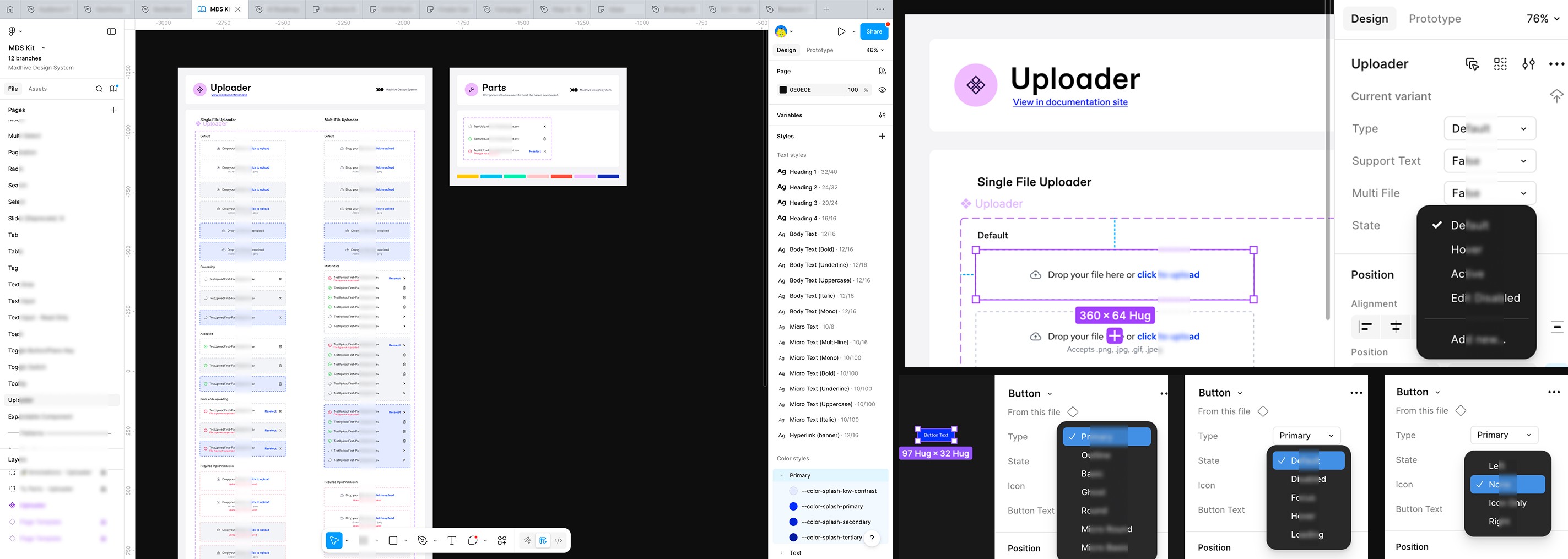
Advanced Properties & Variants
I architected a high-fidelity component library by leveraging Figma’s advanced Properties and Variants to streamline the design system. By engineering complex multi-state components, such as the Uploader and Button sets, I enabled designers to toggle between diverse types, states, and layouts via a simplified sidebar interface. This systematic approach enforces design consistency across the platform while drastically reducing manual overrides and file complexity.
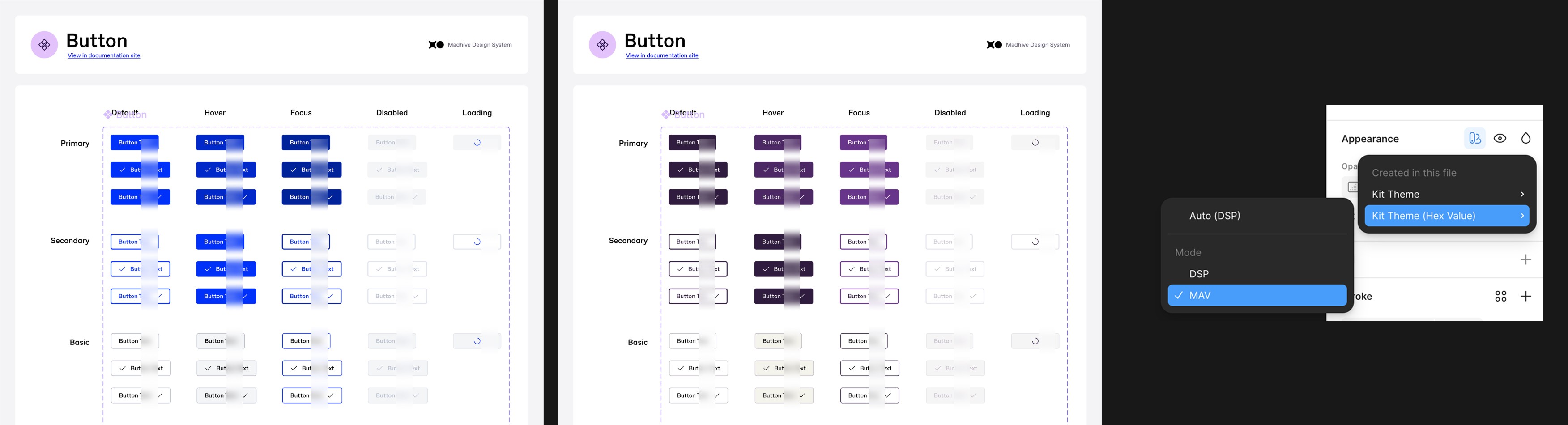
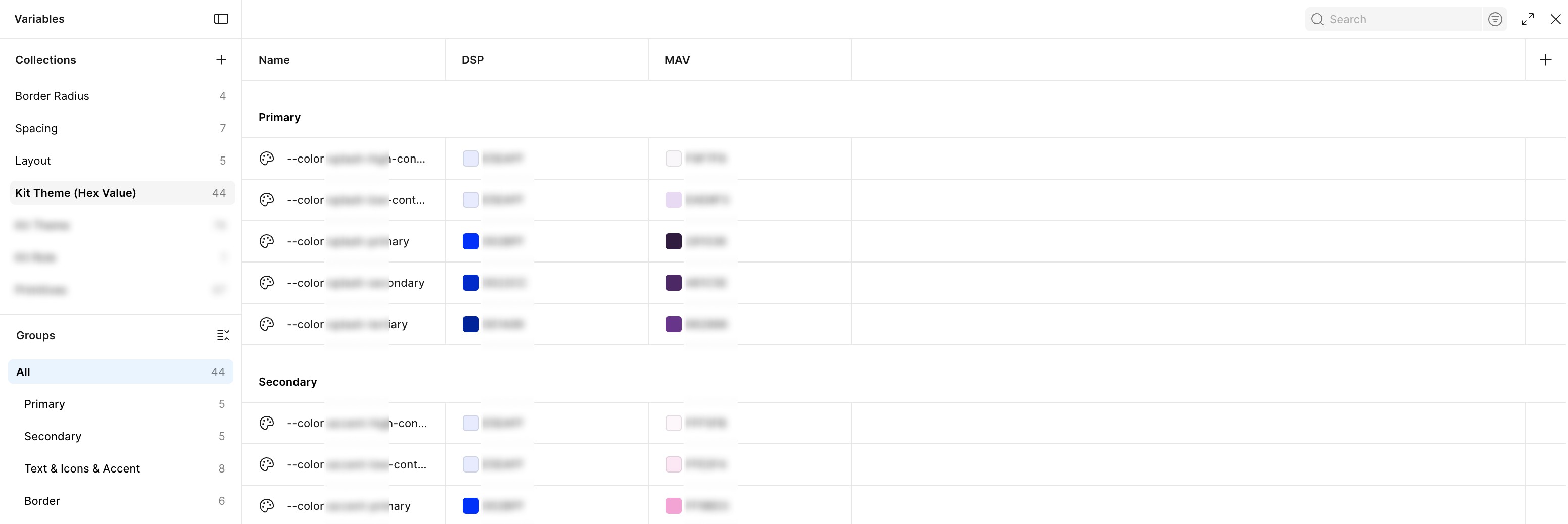
Multi-Platform Theming: Scalable Color Architecture
To support Madhive’s expanding ecosystem, I engineered a robust thematic architecture using Figma Variables and design tokens. By defining a unified naming convention for primary and secondary color palettes, I enabled the system to seamlessly toggle visual identities between the DSP and MAV platforms. This token-driven approach ensures that a single component library can adapt to different brand environments with 100% accuracy, significantly reducing the need for separate assets while maintaining strict brand consistency across all enterprise products.
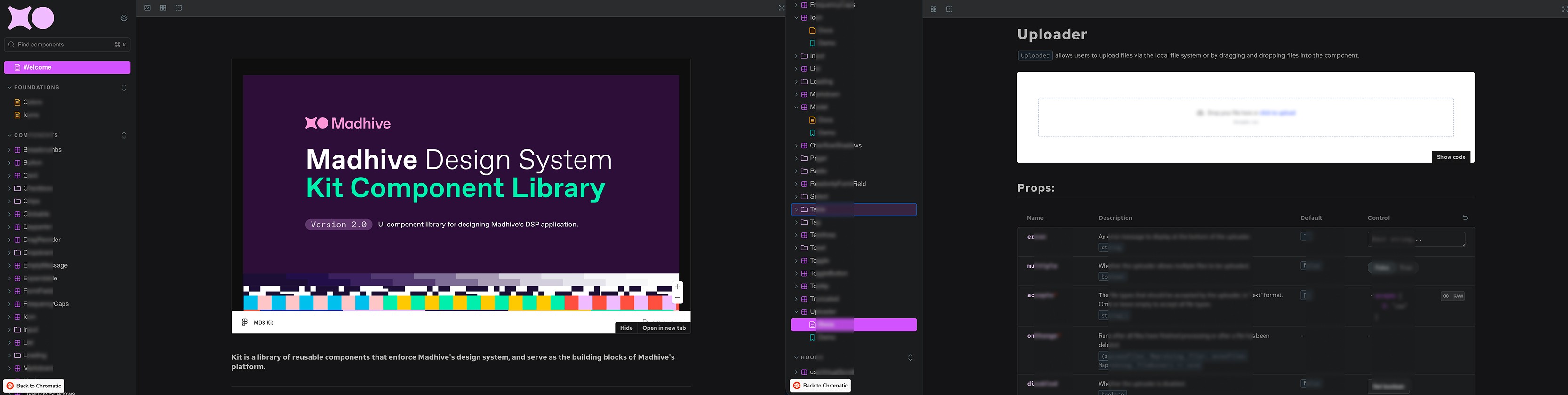
Storybook Integration
To bridge the gap between design and production, I partnered with the Platform UI engineering team to translate the Figma library into a live Storybook environment. This built-in resource serves as the single source of truth, featuring interactive components with synchronized naming conventions and exhaustive technical documentation. By mapping design tokens and properties directly to code, I ensured that engineers could leverage Figma Dev Mode alongside Storybook to achieve 1:1 implementation fidelity across all enterprise products.
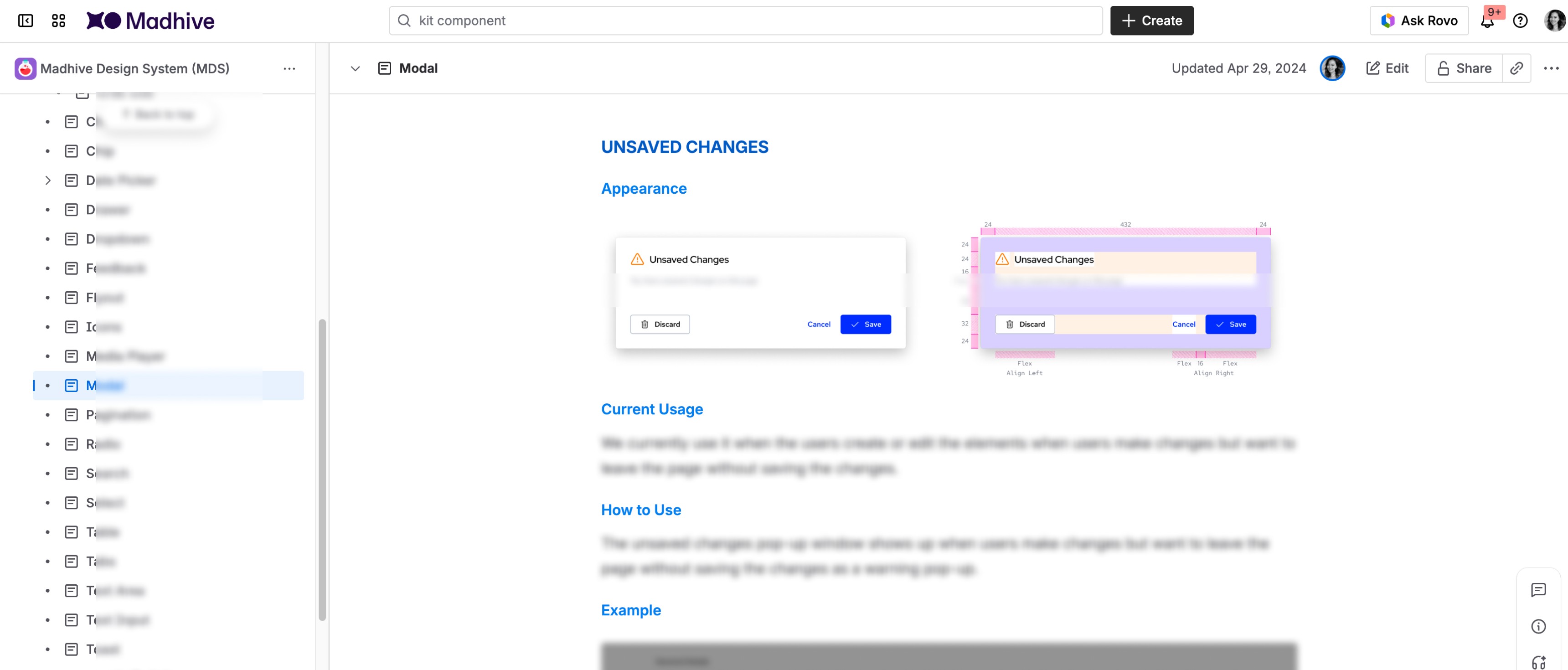
Component Documentation & Guidelines
To equip the team and ensure long-term scalability, I authored comprehensive usage documentation for the entire library. Each component page provides clear guidance on current usage, behavioral patterns, and layout specifications, such as padding and alignment for modals. By standardizing these UX principles and implementation rules, I established a clear framework that streamlines design decision-making and ensures a cohesive user experience across all Madhive products.